
ARBOR GYLPH
PROCESS
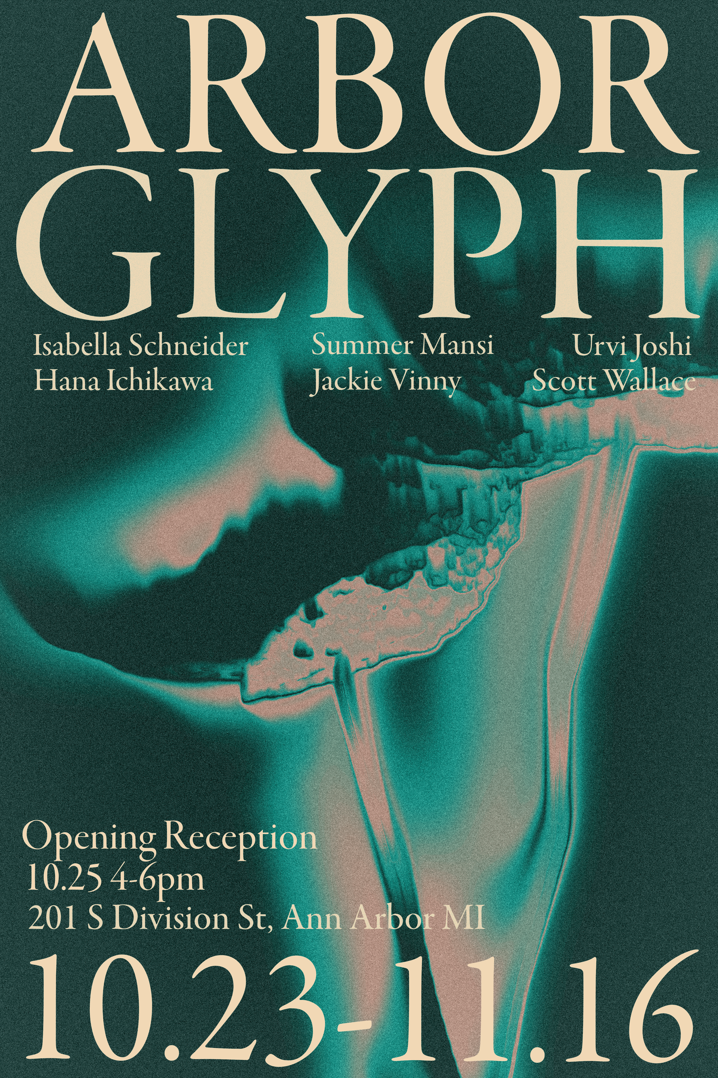
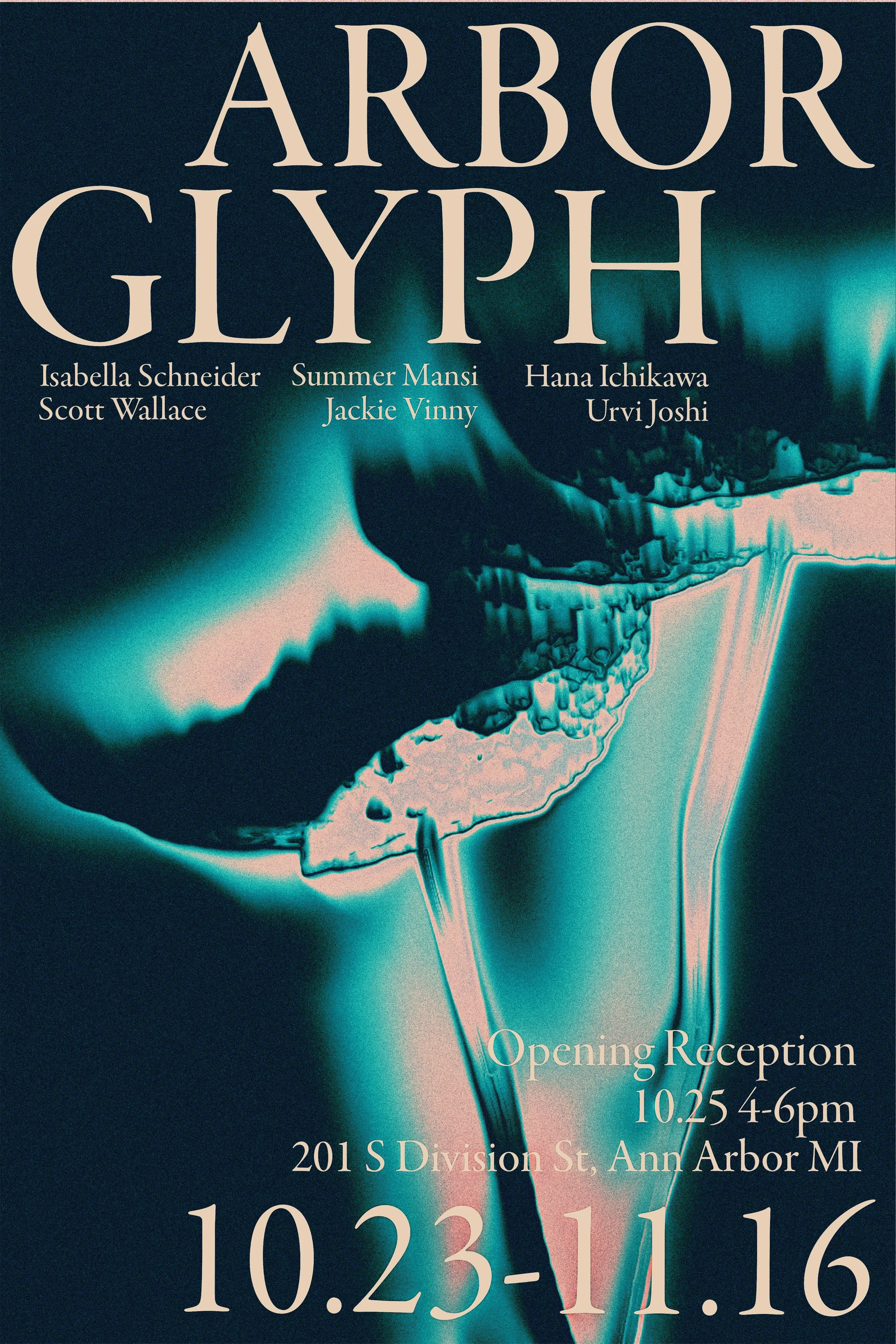
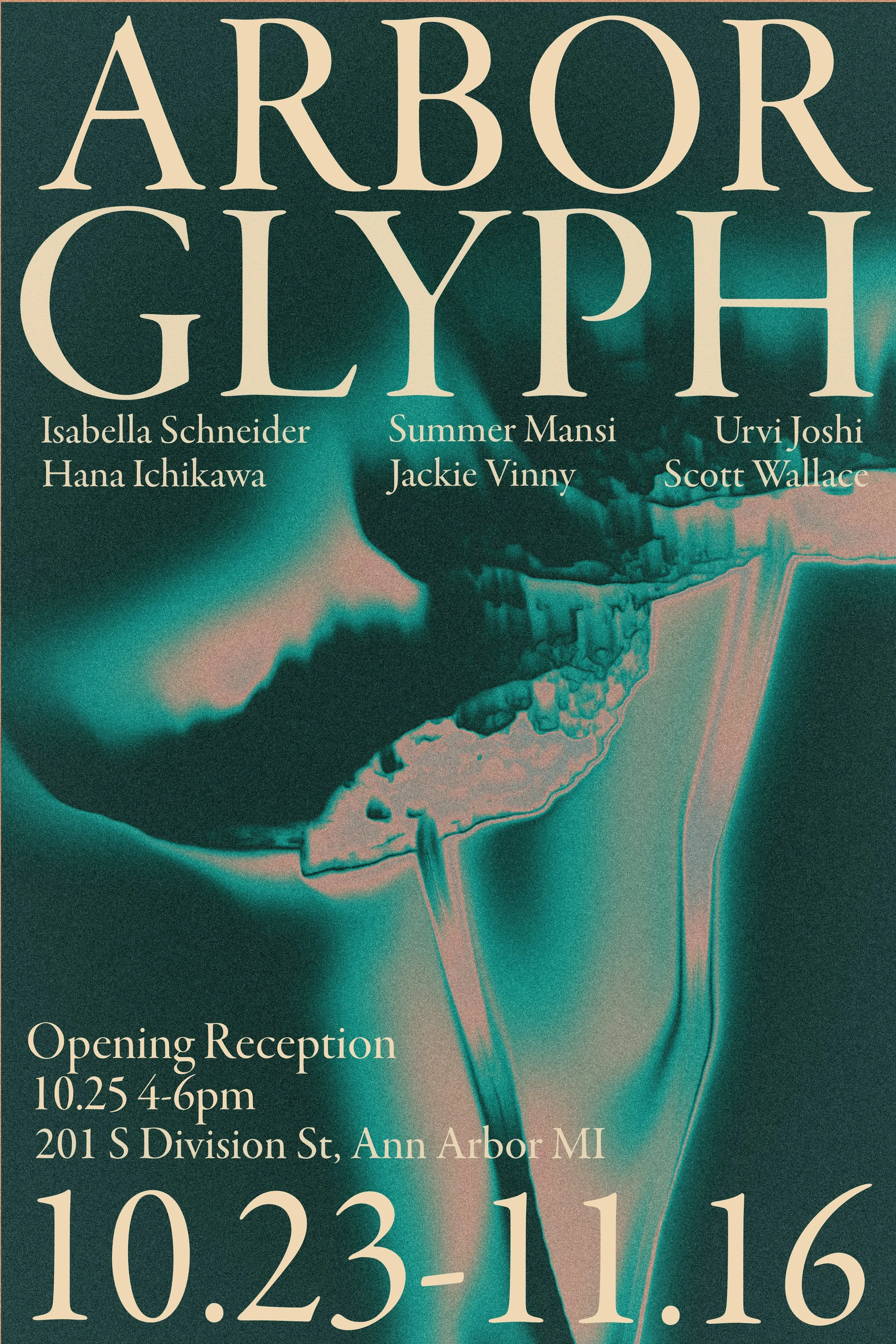
This flyer was created for the Exhibition “Arbor Glyph” an exhibition based on interpretation and nature held at the University of Michigan Stamps Gallery . Through using TouchDesigner, a creative programming software, I made the background image/video, experimenting with various color schemes until I arrived at the final iteration. This allowed me to visually express the essence of nature through dynamic elements. The flexibility of the software gave me the freedom to explore multiple iterations, ensuring that the final design truly captured the theme. It was a rewarding experience that showcased how technology can amplify creative concepts.

FIRST STEPS
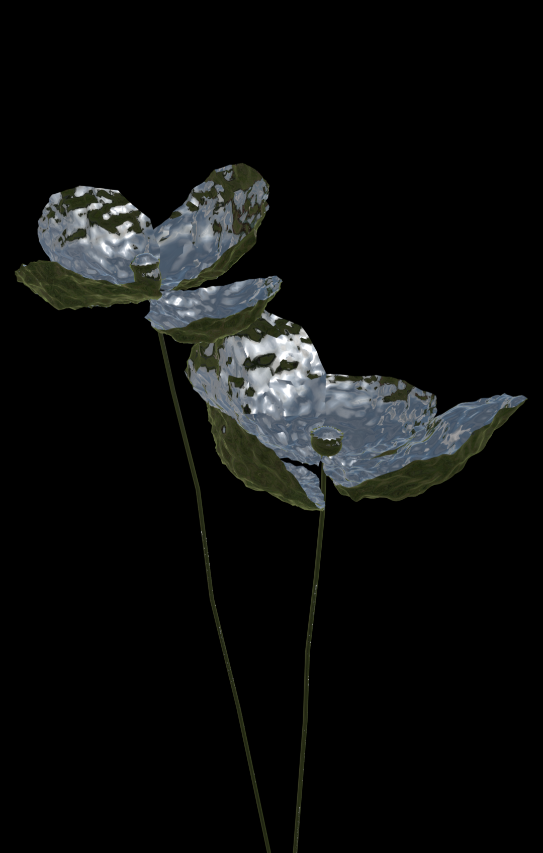
I began my TouchDesigner project by creating a 3D model of a metallic flower, specifically choosing metal as my material due to its high contrast and reflective properties, which work particularly well with TouchDesigner's effects systems. The process of achieving my desired ethereal aesthetic required careful experimentation with both camera angles and contrast levels. My initial attempt, shown in the left image, revealed some challenges - the stem lacked sufficient contrast, and the petal geometry wasn't clearly defined enough. This led me to revise the original 3D model to achieve the precise level of detail and resolution needed for the visual effects I envisioned.

IDEATION
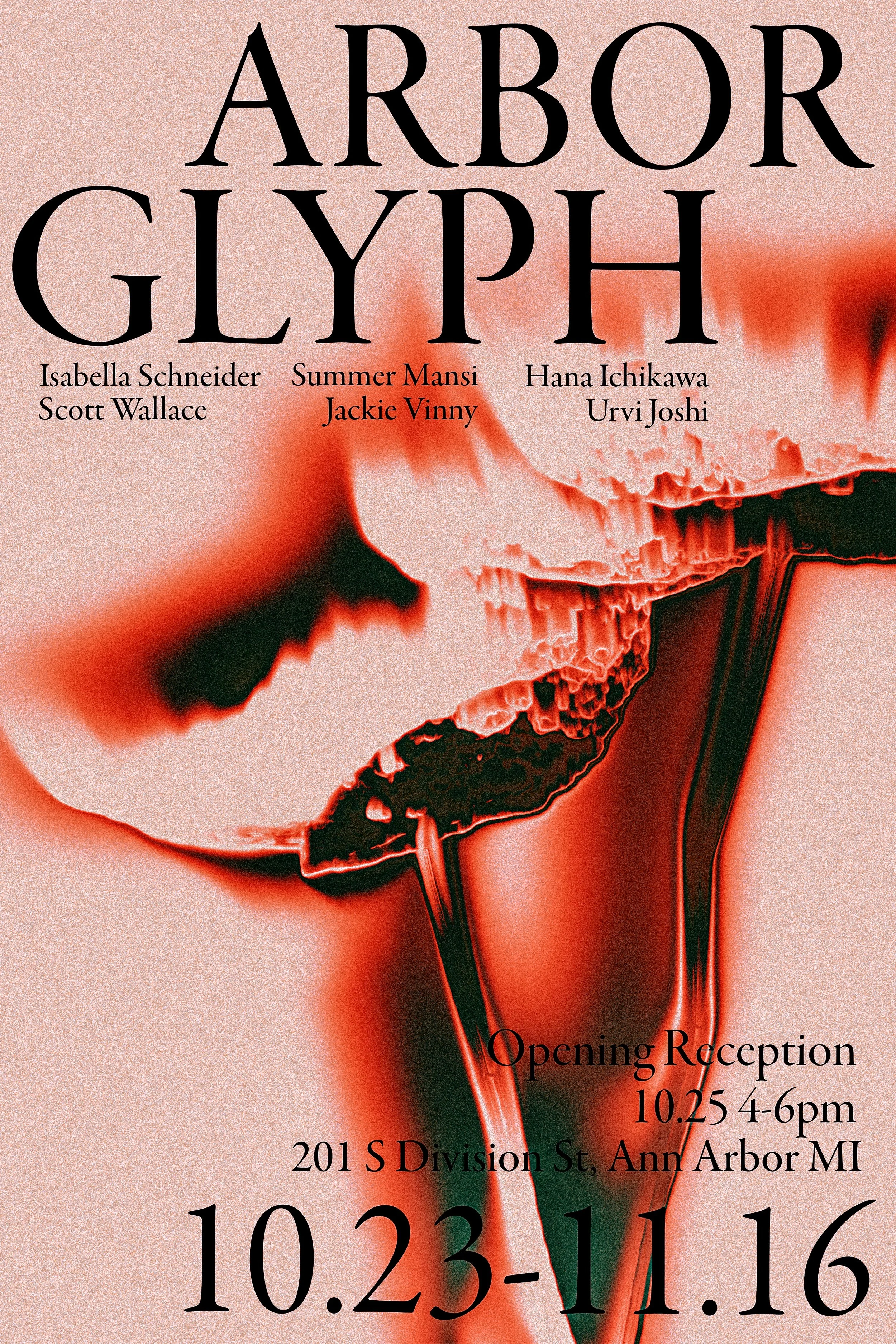
During this stage of the process, I made numerous adjustments in TouchDesigner, and with each tweak, a completely new color scheme emerged. It was at this point that I had to decide which one best represented the intentions of those featured in the exhibition. Through inquiry, I learned that a sultry dark blue-green would be the most fitting choice, as it subtly alluded to the University of Michigan branding without being too overt. This color not only aligned with the desires of the participants but also added a layer of depth to the design.


Iteration #1
Iteration #2

Iteration #3

Iteration #4
Iteration #1
Iteration #2
Final