
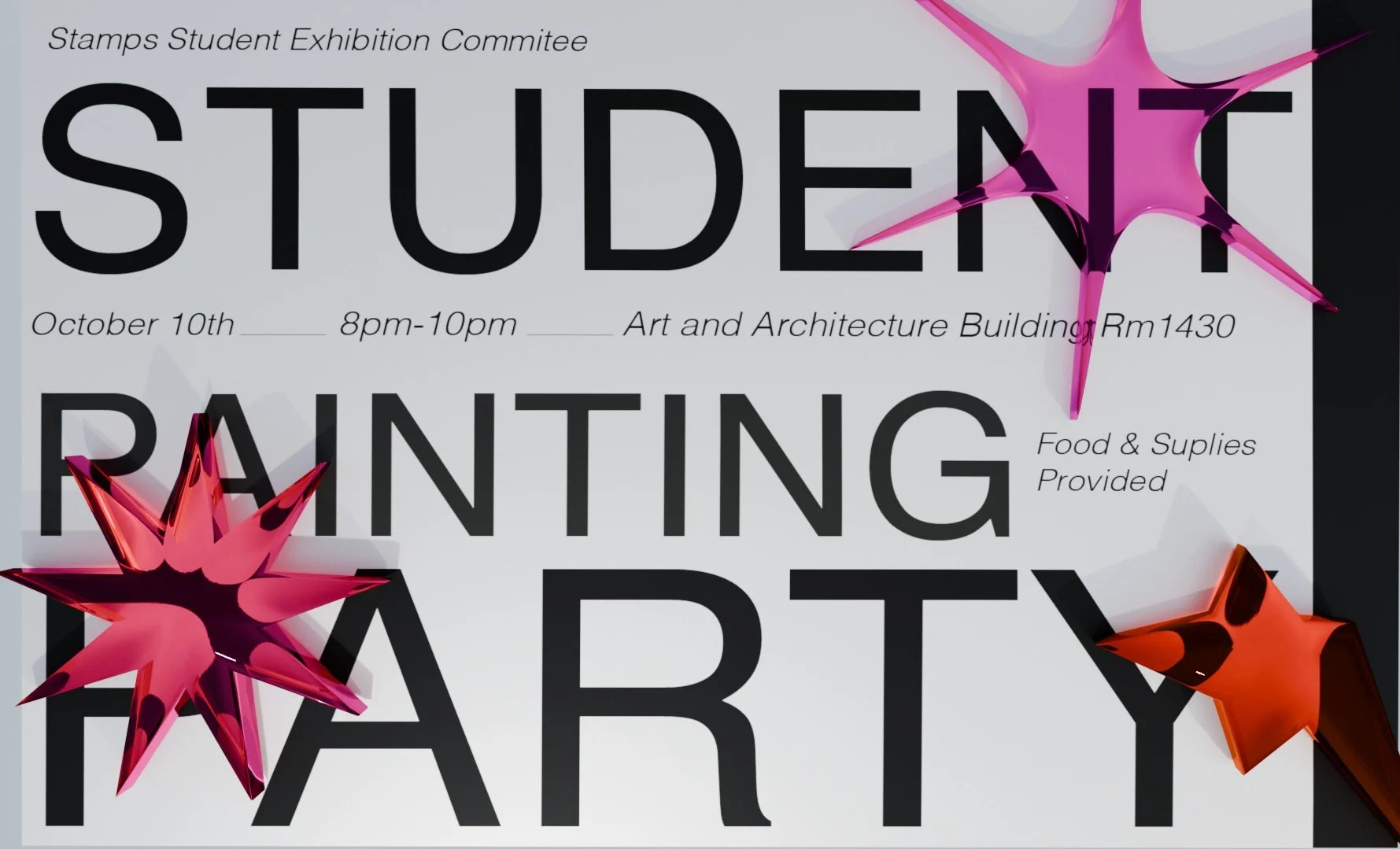
PAINTING PARTY PROMO
ARBOR GLYPH
The painting party, organized in collaboration with Arbor Gyoh, was designed to engage University of Michigan students directly with the artistic process. Participants were invited to create their individual interpretations of trees, with each student contributing a unique vision. By combining these personal artistic expressions, the group collectively produced a collaborative exhibit that showcased diverse perspectives on a single theme.
FIRST STEPS
When designing the poster, my first step was determining the most effective way to display the graphic information. I experimented extensively with various layout proportions, typography, and compositional arrangements. Initially, I explored using Garamond as the typeface, but ultimately chose Helvetica to better align with the conceptual vision, especially in relation to the 3D elements I planned to incorporate.
My design process involved using a UV map to project graphics onto a plane, which I then complemented by integrating 3D shapes. The accompanying image on the right represents an unrendered landscape model, providing a glimpse into the underlying structural concept of the design.
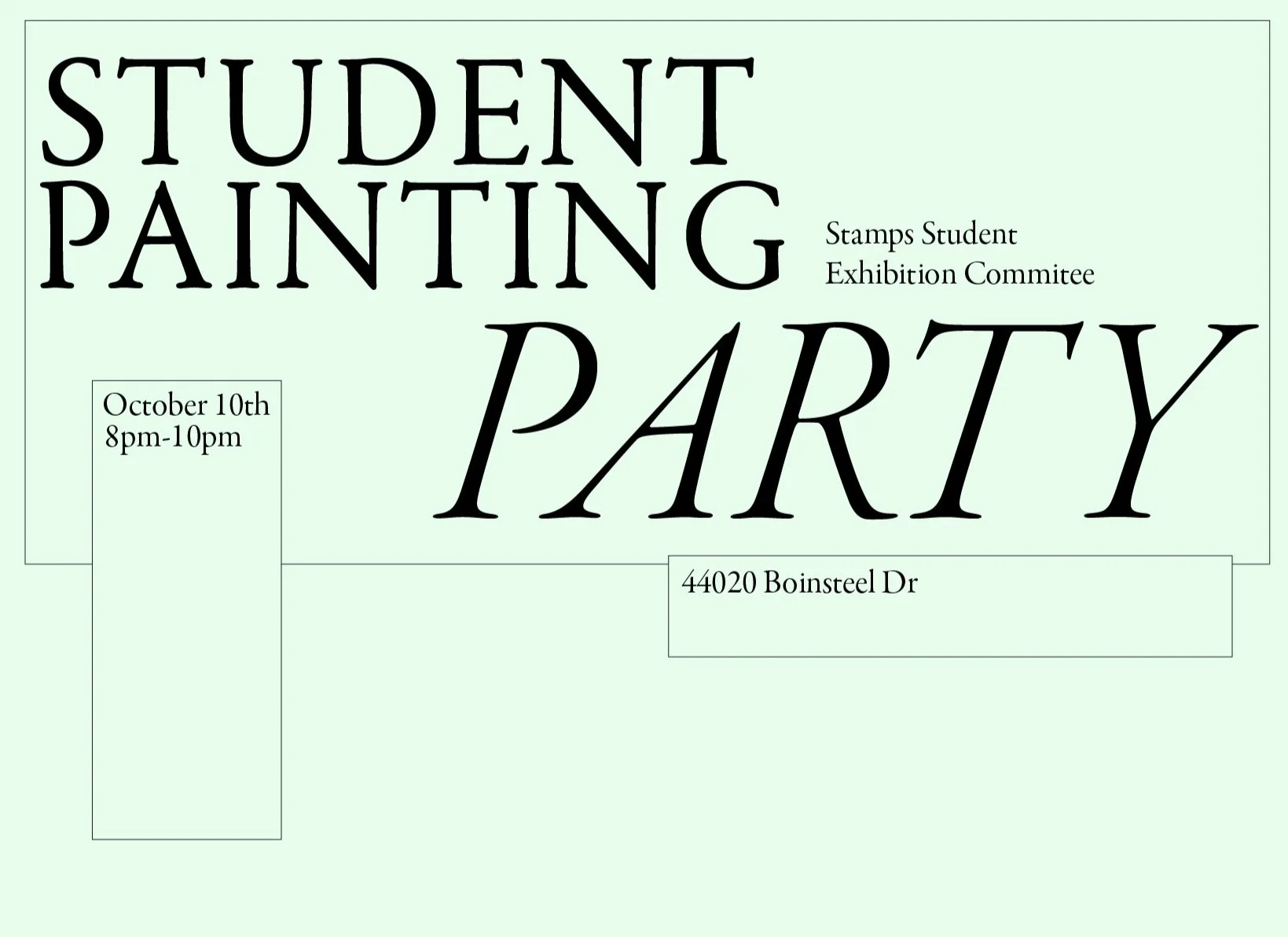
Iteration #1

Iteration #2

Iteration #3
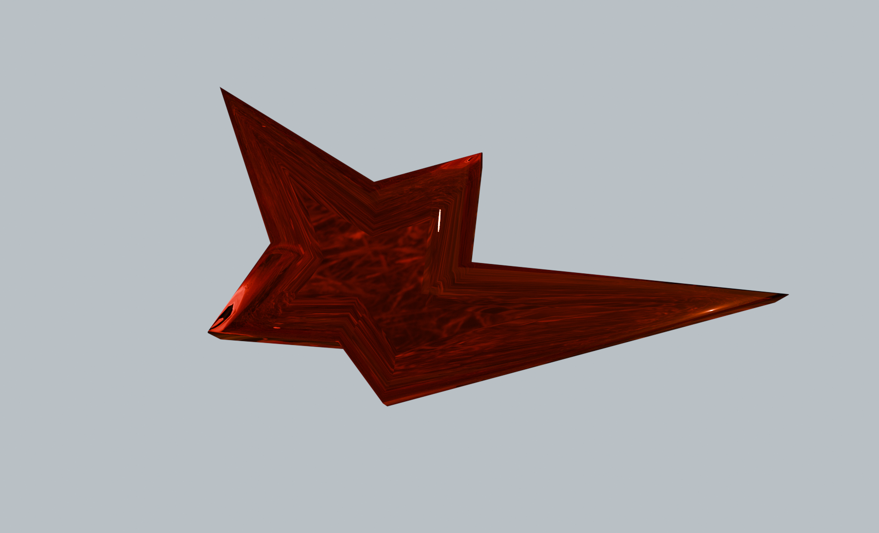
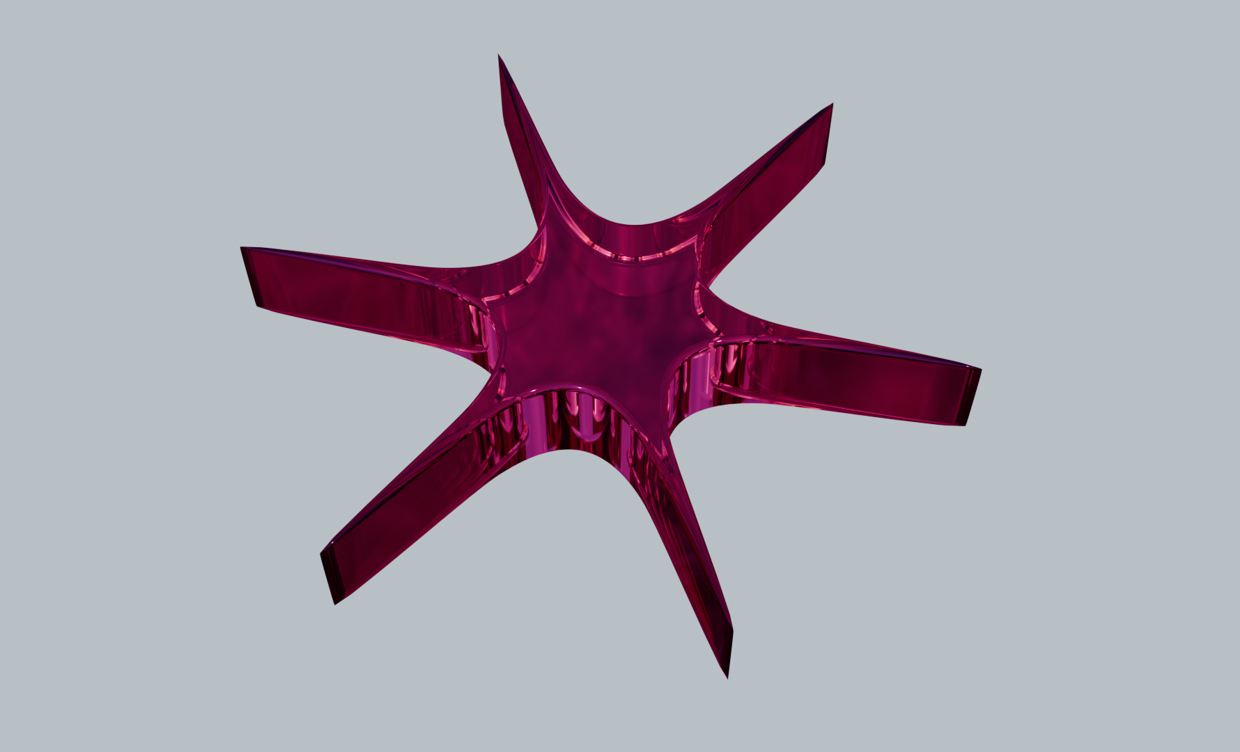
During the initial design phase, I carefully considered the fundamental characteristics of the shapes. My design deliberations focused on critical aesthetic choices: whether to pursue sharp, angular forms or softer, more fluid contours, and whether the shapes should feel natural or more geometric.
Ultimately, I decided on pointy yet organic shapes that would create an exciting visual dynamic. My goal was to craft a design that would be visually compelling and engaging, specifically aiming to attract and intrigue students. By selecting shapes that felt both sharp and somewhat natural, I sought to create a poster that would draw viewers in and spark their curiosity about the event.
IDEATION


REFINEMENTS
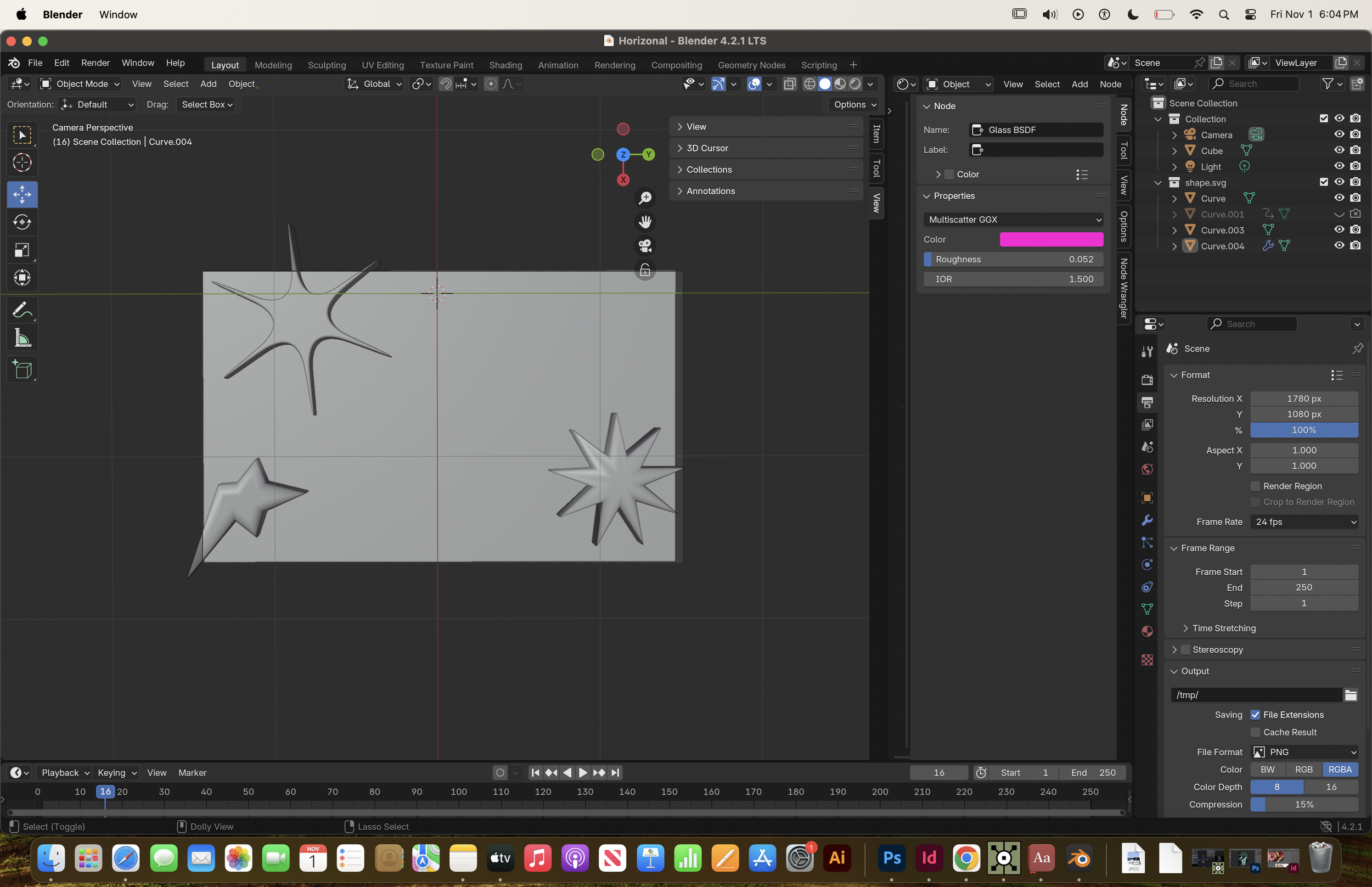
This stage of the design process was the most time-intensive and underwent significant development. I encountered numerous challenges, particularly with the UV map and the positioning of shapes, which necessitated continuous design iterations. In the accompanying image on the right, I was exploring the spatial arrangement and lighting of the shapes, working without the UV map at this point. These
