FLORAL
TRANS-
FORMATION
PROCESS
Through the journey of creating this flyer I begin with taking inspiration from nature as that was the central theme of the exhibition, through the use of touch designer a creative programing sophwear I created the background image/vidio in multiple colors until landing on the final iteration.

PROCESS
This first iteration helped me develop the coded effect I wanted to achieve in TouchDesigner, but through this process, I realized I wasn't entirely satisfied with the final result. Upon reflection, I decided to revisit my source material - while I had originally used a photograph of a flower, I determined that creating a 3D model in Blender would give me much more control over the contrast levels and overall composition. This shift from photo to 3D model allowed me to have precise control over every aspect of the image's properties.
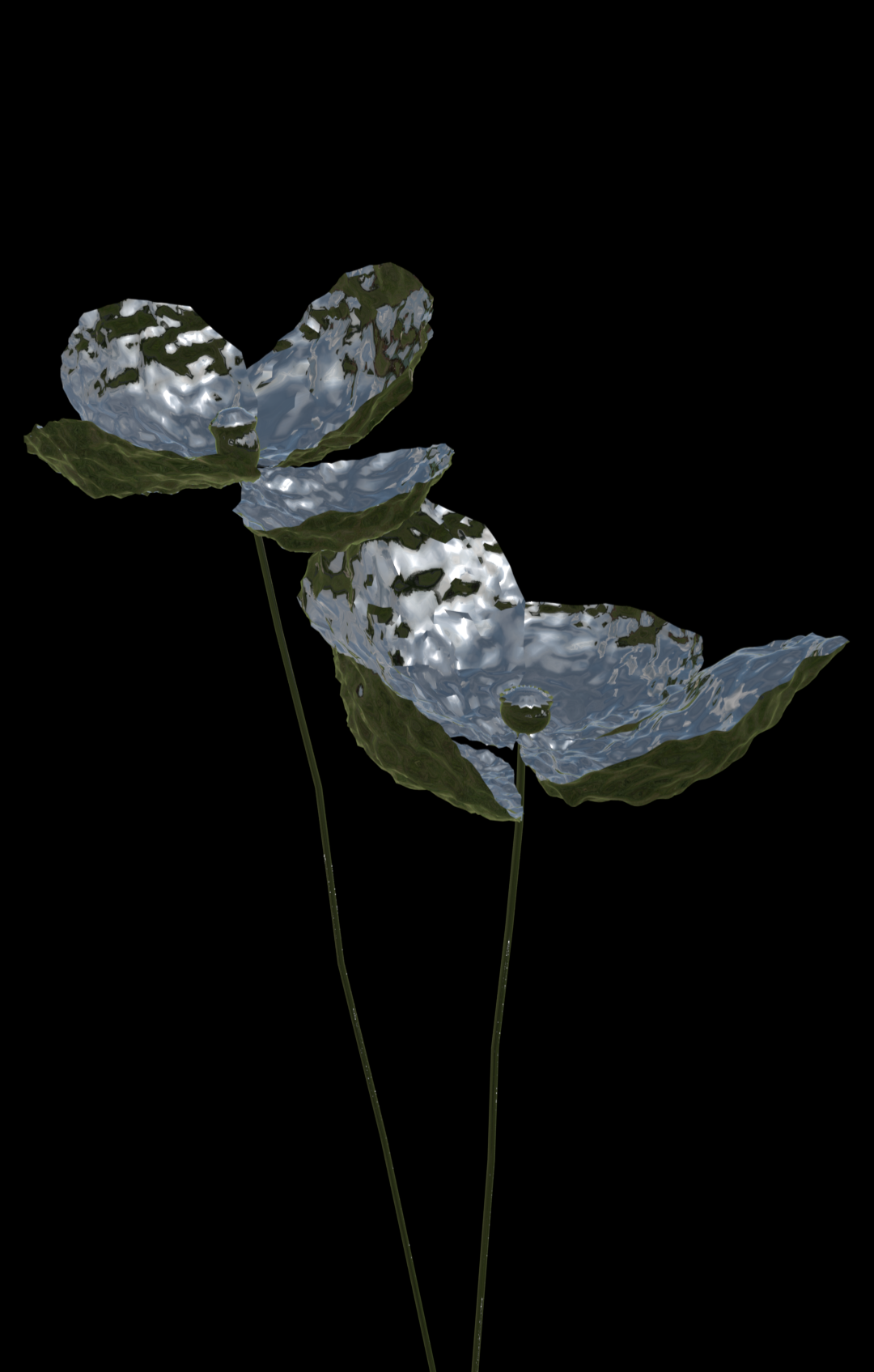
FIRST STEPS
I began my TouchDesigner project by creating a 3D model of a metallic flower, specifically choosing metal as my material due to its high contrast and reflective properties, which work particularly well with TouchDesigner's effects systems. The process of achieving my desired ethereal aesthetic required careful experimentation with both camera angles and contrast levels. My initial attempt, shown in the left image, revealed some challenges - the stem lacked sufficient contrast, and the petal geometry wasn't clearly defined enough. This led me to revise the original 3D model to achieve the precise level of detail and resolution needed for the visual effects I envisioned.

IDEATION
Through tweaking my use of code, I was able to explore different levels of contrast along with different speeds of movement. This control is what I appreciate about software like TouchDesigner, as it allows for such creative flexibility. As you can see, both of the animations above show the same interpreted image through different code, demonstrating how code can shape the perception of a visual. This stark contrast highlights the utility and potential that comes with learning these tools, offering endless possibilities for artistic expression and experimentation. It’s a reminder of how deep control over visual parameters can elevate creative work to new levels.


Iteration #1

Iteration #2

Iteration #3
Iteration #4
IDEATION
During this stage of development, I conducted extensive experimentation with TouchDesigner's parameters, discovering how each minor adjustment spawned entirely new color schemes. Through this process, I gained a deeper understanding of how subtle color modifications dramatically impacted both the visual intensity and emotional resonance of the piece. After exploring multiple variations, I ultimately selected iteration #4, which features a harmonious combination of blue, white, and black - a color palette where each tone complements the others while maintaining a strong sense of cohesion.